Introduction: Why is a High Bounce Rate a Problem?
When running a WordPress website, many beginners face the challenge of attracting visitors but failing to convert them into inquiries or purchases. A high bounce rate means users are leaving before taking the desired action. For beginners, the biggest question is: “How do I create a path that keeps visitors engaged?”
This article explains the basics of navigation design to reduce bounce rates, specifically tailored for WordPress beginners.
Step-by-Step Guide: Key Points in Navigation Design
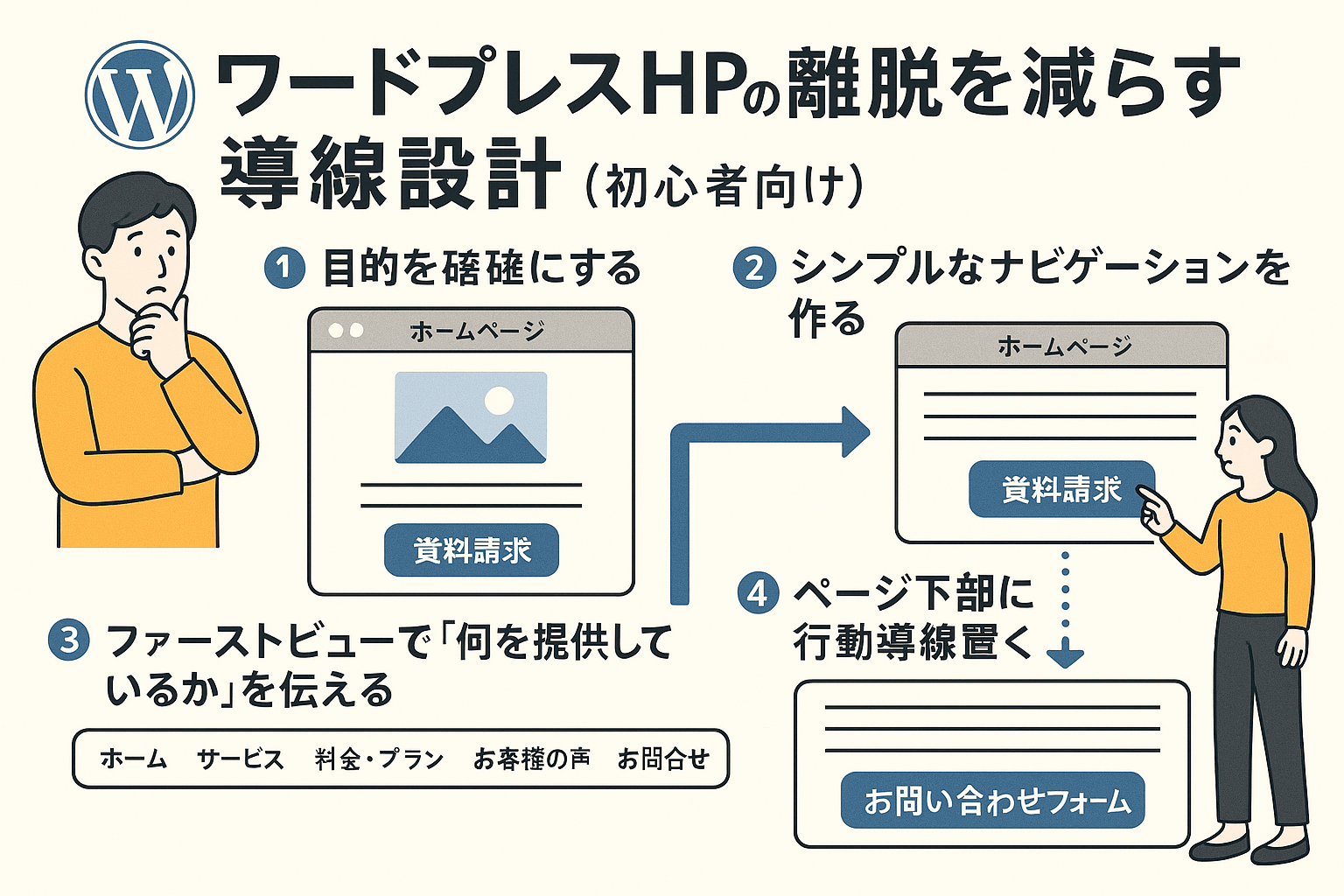
1. Define Your Goal Clearly
Before creating navigation, determine the purpose of your site:
- Do you want more inquiries?
- Are you aiming for downloads or sign-ups?
- Do you want direct purchases?
Having a clear goal determines the entire user flow.
2. Convey “What You Offer” in the First View
Within seconds, users decide whether to stay or leave. The header or hero section should include:
- A brief overview of your service/product
- The benefits users will gain
- A clear call-to-action (CTA) button such as “Request a Quote” or “Contact Us”
3. Keep Navigation Simple
Complicated menus drive users away. Beginners should stick to 5–6 main items, such as:
- Home
- Services / Products
- Pricing
- Testimonials
- Contact
4. Add Calls-to-Action at the Bottom
After reading content, users should have a clear next step. Add:
- Inquiry forms
- Purchase buttons
- Related content links
5. Strengthen Internal Linking
Encourage users to browse more pages by adding links inside articles and sidebars. Example:
- “Read more about this case study”
- “Related guides here”
6. Prioritize Mobile-Friendly Design
Since most visitors use smartphones, optimize for mobile:
- Large, tappable buttons
- Sticky CTA buttons while scrolling
- Readable font sizes
Practical Steps for WordPress Beginners
- Use Plugins or Page Builders
Tools like Elementor or the built-in Block Editor make adding CTAs simple. - Highlight CTA Buttons with Contrast Colors
Choose colors that stand out against your site theme. - Analyze with Google Analytics or Site Kit
Identify high-bounce pages and improve them step by step.
Conclusion: Keep the User in Mind
Reducing bounce rates is not about flashy design—it’s about making user actions easy and intuitive.
By following these basics—clear goals, simple navigation, effective CTAs, and mobile-first design—you’ll see measurable improvements even as a beginner.

コメント