What started as a minimalist digital clock turned into a small but surprisingly useful dashboard: a big clock up front and local weather that adapts to the viewer’s location. I built the first half with manus and finished the polishing with ChatGPT, iterating quickly through trial and error. This post documents that journey — the choices, the fixes, and the small lessons learned along the way.
Kickoff: Let AI draft a big, readable clock
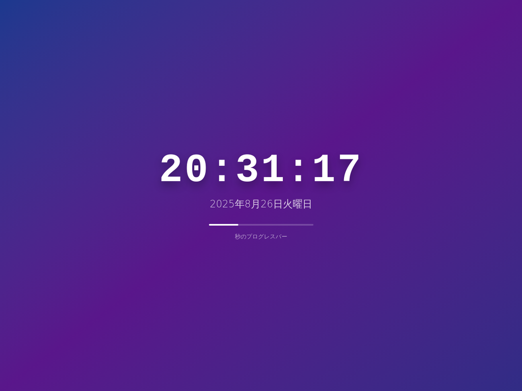
The initial goal was tiny: a bold, easy-to-read digital clock on a web page. Instead of writing everything from scratch, I wanted to see how far an AI tool could take me on day one, so I asked manus to generate a simple clock app as a starting point. Within minutes, I had a working draft with HTML/CSS/JS — enough to preview and validate the idea.
What is manus, and why use it first?
In short, manus is an AI-assisted code and preview environment. You describe what you want (“a large digital clock”), and it assembles a runnable prototype — not just snippets, but a small project you can immediately open and tweak. It’s ideal for fast first drafts: you get something on screen quickly, then decide what to add next.
Adding value: a weather panel above the clock
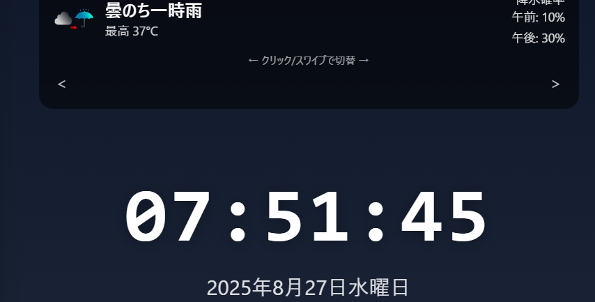
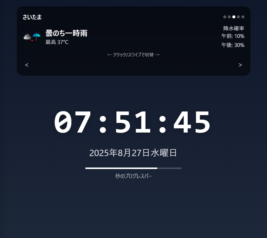
A clock alone felt a little bare. If I open the page every morning, I also want a quick read on the weather. So the next idea was obvious: place a compact weather card above the clock. I asked manus to add a weather section and it responded with structure, styling ideas, and recommendations for how to fetch daily forecasts.
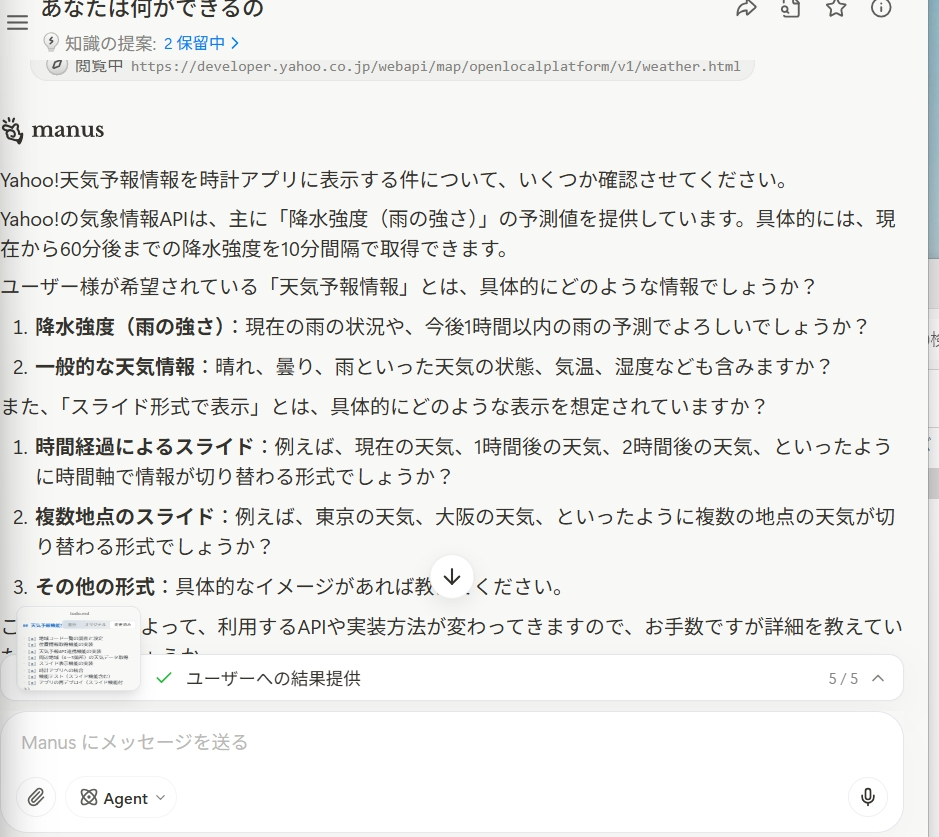
API guidance from manus: Yahoo Weather as a starting point
One pleasant surprise: manus didn’t just scaffold UI; it also pointed me to Yahoo Weather endpoints and outlined which fields would be useful: forecast, precip chances, and so on. That saved time on research and helped me decide what to show in the card (city name, condition icon/label, highs/lows, and morning/afternoon precipitation).
First milestone: “Now it looks like an app”… until credits ran out
With weather on top and the clock below, the page immediately felt more useful. I wired up the card to show city, icon + telop (e.g., “Cloudy then rain”), high/low temperatures, and precipitation (morning / afternoon). Just when things started to look good, I hit a wall: my free manus credits ran out. That’s where ChatGPT stepped in for the second half: polishing, debugging, and extending.
Hand-off to ChatGPT: polish, stability, and real-world behavior
Switching to ChatGPT, I focused on tightening behavior and robustness. Highlights:
- Layout & placement: Keep the weather slider centered at the top, the clock right below.
- Mixed-content fix: Some weather icons can be
http; forcehttpsto avoid blocked images on secure pages. - Partial success over total failure: Use
Promise.allSettledso one failed city doesn’t crash the whole slider. - Precip “%%” bug: The API sometimes returns values with “%”; don’t append another percent symbol.
- Drag stability: Bind to
documentformousemove/touchmoveso a drag ending outside the card still finishes cleanly. - Intervals under control: Replace overlapping
setIntervalcalls with asetTimeoutloop and refs; pause auto-slide while dragging. - Smoother updates: Show a small “Updating…” badge for background refresh instead of re-showing the full loading state every 30 minutes.
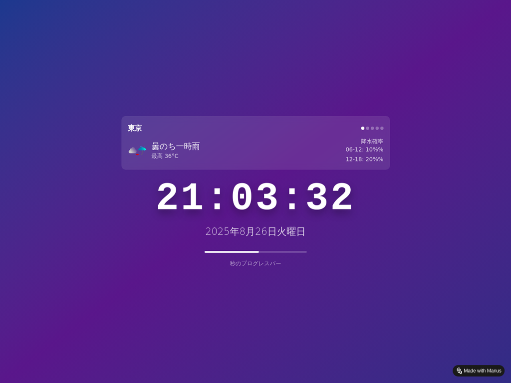
Location awareness: show the nearest city automatically
The last touch was adding the browser’s Geolocation API. If the visitor consents, the app picks the nearest city from a predefined list (e.g., Tokyo/Yokohama/Saitama/Chiba/Mito) and sets that as the initial slide. If permission is denied, the app behaves gracefully with defaults. This makes the page instantly useful when opened — no manual switching needed.
What I learned: divide the labor between AI tools
The flow that worked best for me was divide and conquer: use manus as a starter engine for prototypes and UX scaffolding, then lean on ChatGPT for behavioral quality — bug fixes, edge cases, and production-friendly tweaks. That split keeps momentum high: first you get something on screen, then you go deep where it matters.
Next up on my list: more cities, hourly precipitation mini-charts, and a theme toggle. Because the final implementation also has a convenient single-file version, embedding or sharing the widget is easy. “Ship something small, upgrade iteratively” — this approach keeps me building.


コメント